Supply Schedule and Supply Curve
Learning Contents:
·
Individual Vs. Market Supply Schedule
·
Individual Vs. Market Supply Curve
·
Difference between Individual and Market Supply
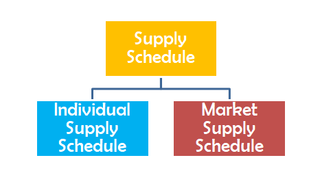
Supply
Schedule
A table that shows the
relationship between quantity supplied and price of the commodity is called supply
schedule. In other words, supply schedule is a table showing different
quantities of a commodity that sellers are willing and able to sell at different
possible prices during a particular period of time.
The supply schedule is
generally based on the law of supply
that states that other things remains constant; there exists a positive or direct
relationship between the price and quantity supplied. The quantity supplied increases at higher price as it generates
high revenue and profits for the sellers and vice versa. The supply schedule
generally consists of two columns: one for the price of a commodity and other
for the quantity supplied. The supply schedule is classified into two
types:
Supply
Curve
Supply curve is the
graphical representation of the supply schedule. It also shows the positive relationship
between price and quantity supplied of the commodity. Supply curve is also classified in two types:

Individual Supply
Schedule
A table that shows the
different quantities of the commodity that one seller or firm is willing and
able to sell at different possible prices of that commodity during a particular
period of time.
Individual Supply Schedule
of Firm ‘A’
|
Price of Apples (Amount in ₹) |
Quantity Supplied (Units)
|
|
20 |
1 |
|
30 |
2 |
|
40 |
3 |
|
50 |
4 |
Explanation:
The above schedule depicts the individual supply schedule. We
can see, when the price of the apples is ₹20, a seller sells 1 unit of apple. Similarly, when price rises to ₹50, he sells 4
units of apple. It indicates that there is a positive relationship between
quantity supplied and price of the apples.
Individual Supply Curve
Individual supply curve is the graphical representation of individual supply schedule. It shows the relationship between price and the quantity supplied by a single seller or firm. An individual supply curve shows an individual seller’s behavior that is willing to sell his commodities at different prices. It slopes upward as it shows the direct relationship between quantity supplied and the price of the commodity.

The quantity supplied
by a seller or firm is shown on X- axis and the price of the apples is shown on
Y-axis. The upward sloping SS curve is an individual supply curve that shows
the quantity supplied of apples at different prices. Individual supply curve
slopes upward from left to right indicating the positive relationship between
price and quantity supplied of the apples. We can see that, when the price of
apples is ₹ 20 per
unit, a seller sells its 1 unit and when the price goes to ₹50 per unit, he sells its
4 units.
Market Supply Schedule
It is table showing
different quantities of a commodity that all sellers or firms are willing to
sell at different possible prices during a particular period of time. It
considers the sales by all the sellers in the market. We get the market supply
of a commodity by doing the total of quantity supplied by all the sellers at
different prices.
To understand this
concept, we assume that there are three sellers ‘A’, ‘B’ and ‘C’ in the market.
Their quantity supplied at different prices is given in the market supply
schedule as below.
Market
Supply Schedule of Sellers ‘A’, ‘B’, ‘C’
|
Price of Apples (amount in ₹)
|
Quantity
supplied
( units in kg) |
Total Quantity
supplied of Apples by
firms ‘A’, ‘B’ and ‘C’ (A+B+C) |
||
|
A
|
B
|
C
|
||
|
20 |
1 |
2 |
3 |
6 |
|
30 |
2 |
3 |
4 |
9 |
|
40 |
3 |
4 |
5 |
12 |
|
50 |
4 |
5 |
6 |
15 |
Explanation:
The above schedule depicts the market supply schedule. It
shows that when price of the apples is ₹ 20; market supply is 6 units of
apples. Similarly, when price rises to
₹50; market supply rises to 15 units of apples. It indicates that there is a
positive relationship between quantity supplied and price of the apples.
Market
Supply Curve
Market supply curve is
the graphical representation of the market supply schedule. It shows the
different seller’s behavior that are willing to sell their commodities at
different prices. The quantity supplied by all the sellers or firms in the
market is shown on X- axis and price of the apples is shown on Y-axis.


Explanation
The quantity supplied
by all the sellers or firms ‘A’, ‘B’ and ‘C’ is collectively shown on X- axis and price of the apples is
shown on Y-axis. In Fig. 4, the SS curve is the market supply curve that shows
the quantity supplied of apples at different prices. Market supply curve slopes
upward from left to right indicating the positive relationship between price
and quantity supplied of the apples. We can see that, when the price of apples
is ₹20 per unit;
market supply is 1+2+3 =6 units and when the price goes to ₹50 per unit; market supply
goes to 4+5+6 = 15 units.
Difference
between Individual supply and Market supply
|
S.No. |
Individual Supply |
Market Supply |
|
1. |
Individual
supply is the supply of individual or single seller or firm. |
Market
supply is the supply of all the sellers or firms in the market. |
|
2. |
Law
of supply may or may not hold true because an individual seller may or may
not consider price, objective of the firm factor etc. while selling the
commodities. |
In
this case, Law of supply holds true as the entire sellers would not ignore
the price or other factors while selling the commodities. |
Let’s
try some questions
Choose the Correct Answer
1. ____________ is a table representing
the quantity supplied by a single seller at different prices of a commodity.
a. Individual supply schedule
b.
Market supply schedule
c.
Both
a. and b.
d.
None
of above
2. The graphic representation of a table showing price and supply relationship for a commodity in the market is called:
a.
Individual
supply curve
b.
Producer’s demand curve
c.
Market
supply curve
d.
Consumer’s demand curve
3. Graphical representation of supply curve of an individual firm in the market is called:
a.
Individual
supply curve
b.
Producer’s demand curve
c.
Market
supply curve
d. Consumer’s demand curve
4. A supply curve differs from a supply schedule because a supply curve
a. holds the number of suppliers constant,
whereas the supply schedule allows the number to vary.
b. is
a graph and the supply schedule is a table.
c. holds
resource prices constant, whereas the supply schedule allows them to vary.
d. represents one firm, whereas the supply schedule represents all firms in the market.
5. A supply curve shows the relation
between the quantity of a good supplied and
a. the price of the
good. Usually a supply curve has negative slope.
b. income. Usually
a supply curve has positive slope.
c. income.
Usually a supply curve has negative slope.
d. the price of the good. Usually a supply
curve has positive slope.
6. The market
supply curve shows
a. the effect on
market demand of a change in the supply of a good or service.
b. the quantity of
a good that firms would offer for sale at different prices.
c. the
quantity of a good that consumers would be willing to buy at different prices.
d. All of the above are correct
Answer Key
|
1.a |
2.c |
3.a |
|
4.b |
5.d |
6.b |
Thanks & please
share with your friends
Comment if you have
any questions.
(Keep Learning and Keep improving)


Comments
Post a Comment